The SP 500 fell roughly 2.25% last week – it’s first weekly decline since mid-May ’23 – per the technical software. The YTD 60% / 40% balanced portfolio return ended last week at 11.22%, versus the 13.27% YTD return the prior week and the 10.98% as of June 30 ’23.
CPI and PPI data this week:
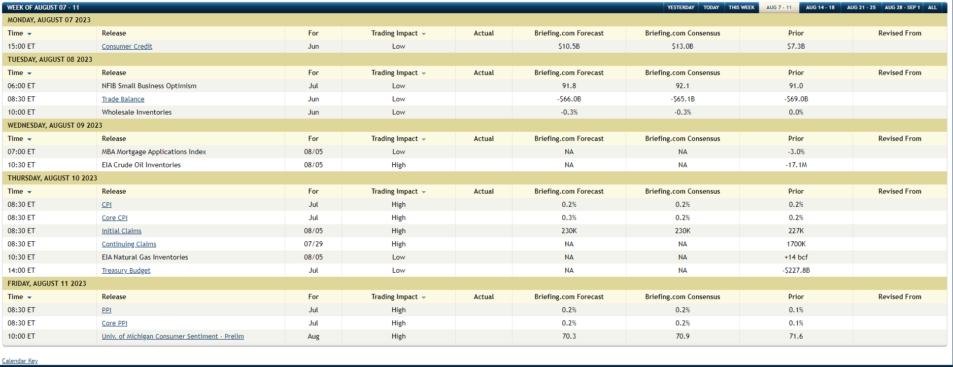
The attached is the economic releases due out this week as detailed by Briefing.com.
The CPI will likely get a lot of attention: the tough part to the CPI / PPI data the last 18 months, is that the “compares” for the CPI get tougher as we move through 2023, since CPI inflation peaked in June ’22.
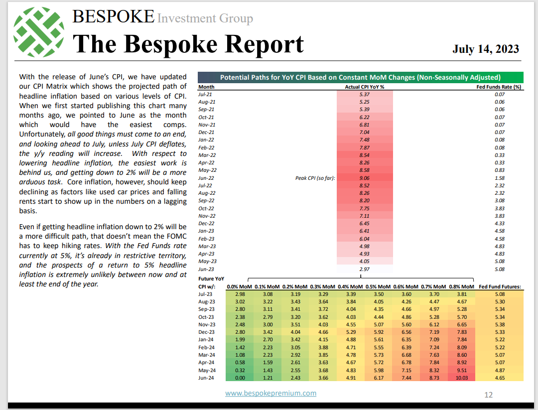
Personally, I think this Bespoke chart remains one of the best inflation maps being published today.
Note “peak CPI” in June ’22 (top half of chart), but then the bottom half of the chart / table is where the rubber really meets the road: note how for July ’23’s expected CPI print, a +0.0% or +0.1% (low end of expectations) will leave overall CPI at just 3%, but with the above Briefing.com table expecting +0.2% for overall CPI and +0.3% for Core CPI, it’s more likely the year-over-year will come in at 3.19% or 3.29%.
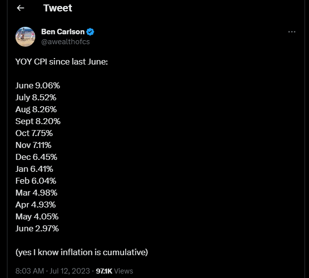
Here’s a better look at the positive progression the last 12 months:
Even Bespoke acknowledges that getting the CPI or general inflation rate down to a “consistent” 2% run-rate will be quite “arduous” and I’d have to agree.
Quick editorial comment: one of the problems with hyper-focus on any particular set of economic data, is that investors start to see “hybrids” or other proxies popping up to either refute or support a particular bias on the data. There are so many inflation proxies today, and more have developed over the last 30 years, with “prices paid” on all the ISM data, and the Fed’s NowCast data (some of which I think is helpful), but we still have CPI, PPI, the PCE deflator data, the “average hourly earnings” data within the jobs report, the “employment cost index data, and there is probably a bunch more that can’t be immediately recalled. Supposedly, Jay Powell has used “core services, ex housing PCE inflation” as one measure that’s been frequently cited on Twitter.
Whatever we see Thursday and Friday from CPI and PPI, expect the arguments to continue to rage.
Are Bonds Prepped for a Decade of Returns like Stocks Saw from 2000 to 2009 ?
Remember, inflation is all about expectations, and bond markets dislike inflation because inflation reduces real (inflation-adjusted) returns.
Here’s two scarier charts from two credible sources:
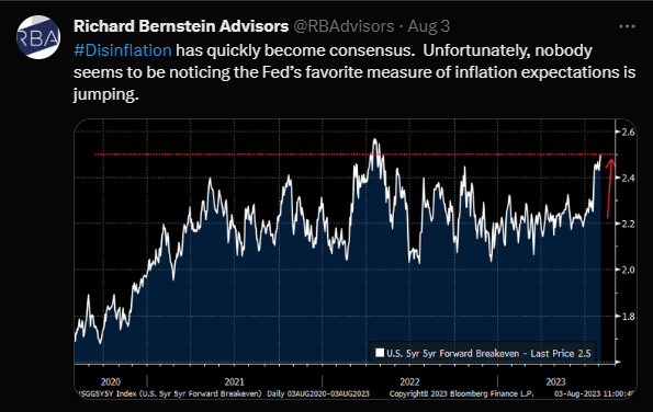
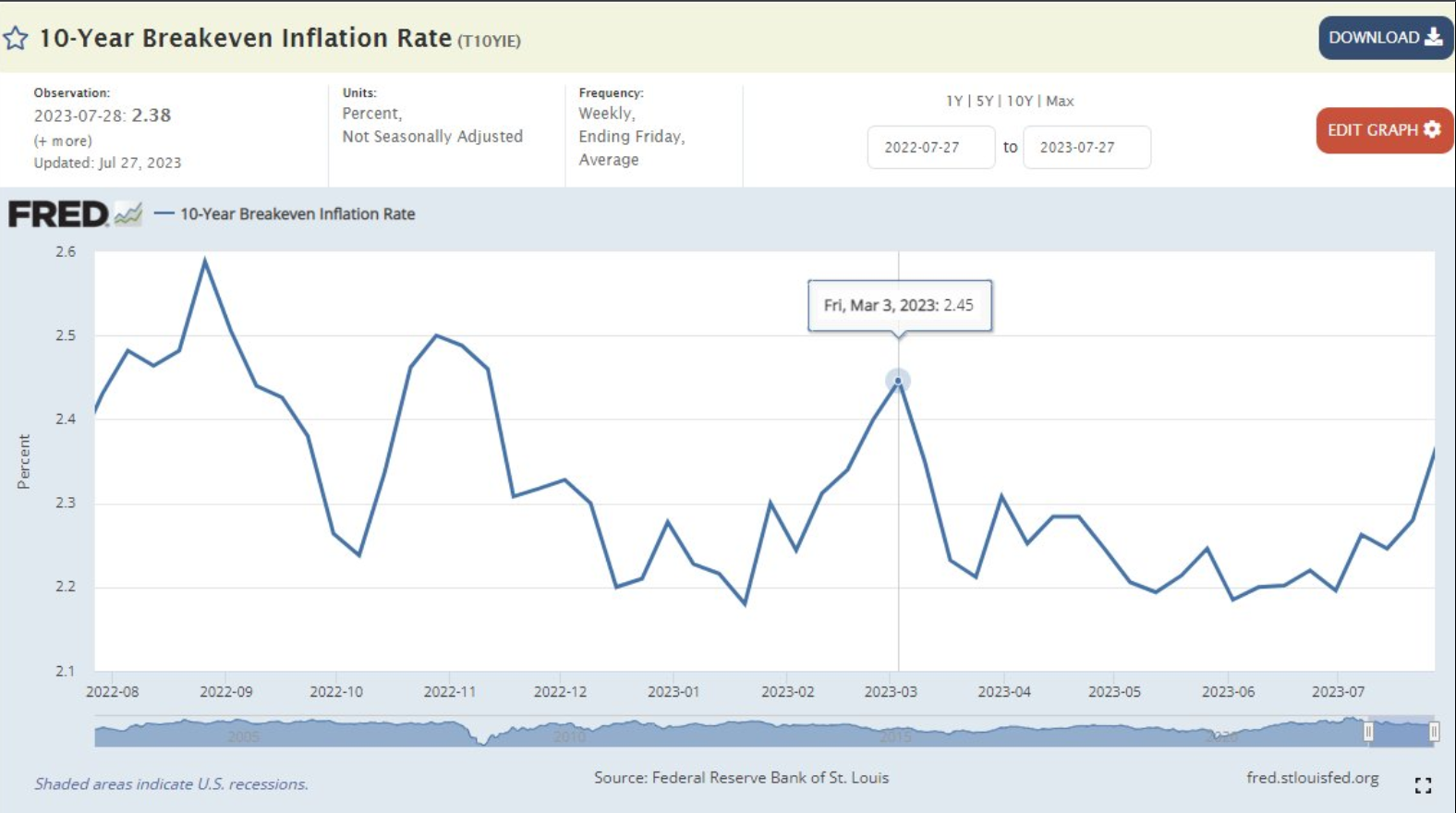
The first chart is from Rich Bernstein Advisers, while the 2nd chart was cut-and-pasted from Mike Zaccardi’s (@mikezaccardi) twitter feed, from late July and includes the Fed’s (FRED) 10-year breakeven inflation rate chart.
Inflation expectations are rising, not falling, and the 10-year breakeven inflation rates are doing the same, which is not what you’d like to see after a 500 – 525 basis point increase in the fed funds rate.
Two charts / tables on bond returns:
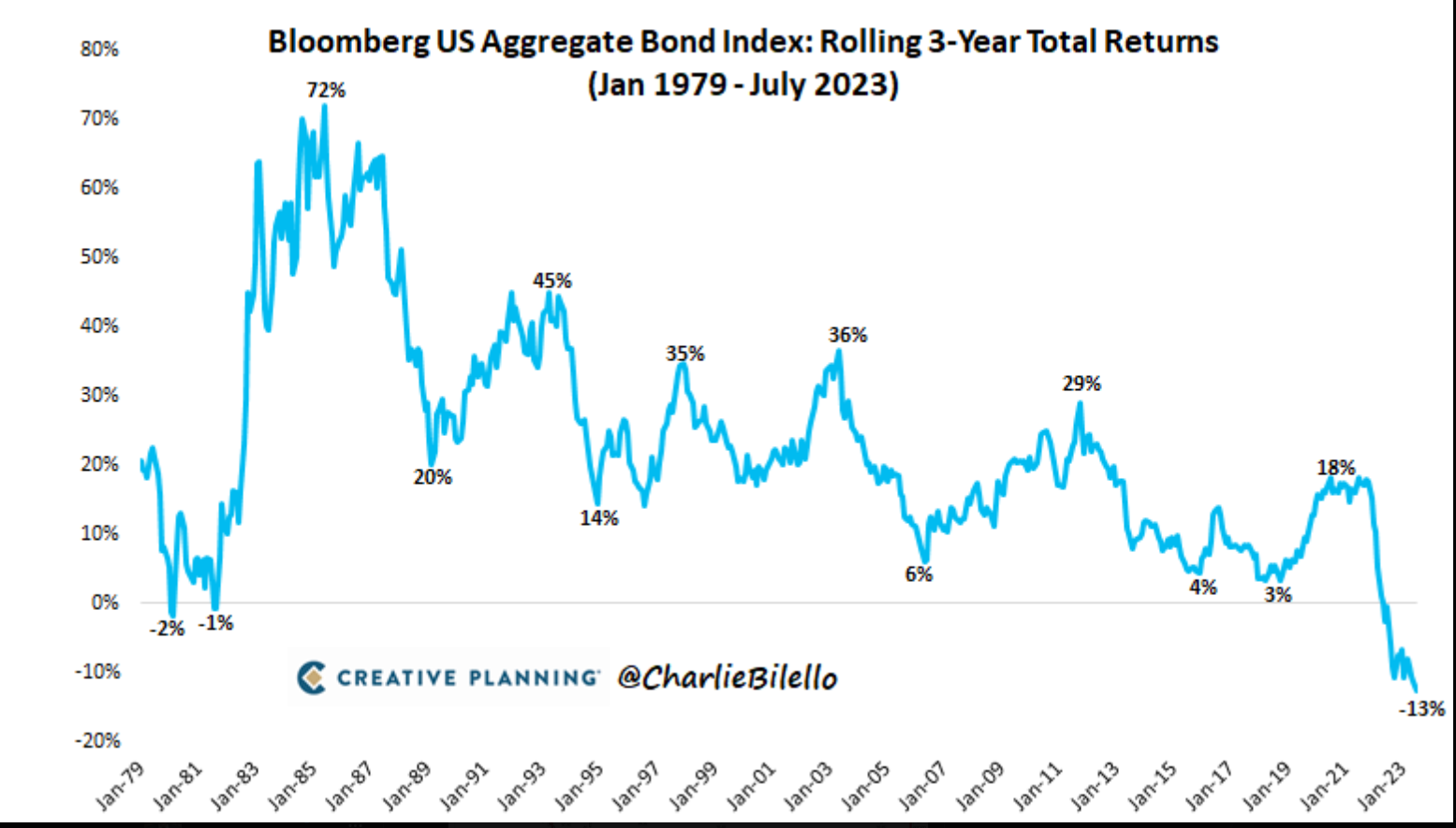
Charlie Bilello shows the rolling 3-year returns on the bond market benchmark, the Barclays Aggregate.
Is that bullish or bearish bonds and interest rates ?
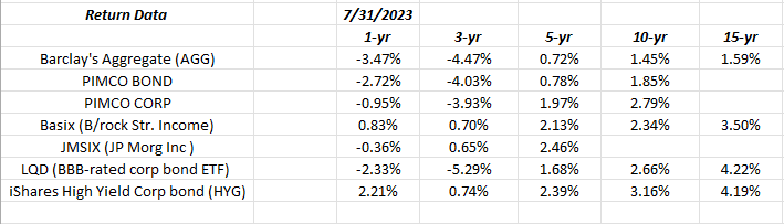
Will it’s a little more “industrial” quality, using Morningstar return data, I update this table on the last day of every month to stay abreast of both short and longer-term bond market asset class returns.
The fact is 1 – 10 year return buckets are pretty thin and after incorporating the burst of inflation we’ve seen in the last 18 months, real (inflation adjusted) returns are now pretty close to zero through 10 years.
Summary / conclusion:
If readers would ever get a hold of the data, which is less available today, simply because so many companies realize what a gold-mine good return data is, (this deserves an entirely separate article), but if you look at the “annual” return for the SP 500 from the year 2000 to 2009, or more precisely from January 1, 2000 to December 31, 2009, that “return” was roughly 1.25% – 1.5% per year for the decade, the lowest annual return since the 1930’s, which was sharply negative thanks to an errant Federal Reserve and the Great Depression.
Could we see an equivalent decade for bonds i.e. the Barclays Aggregate for this period from 2020 to 2029 ?
Anything is possible, but it’s less likely I would suspect given the Fed will surely break the back of inflation, rather than let it remain too uncomfortably elevated for too long.
Why is the US economy still so strong ? It’s an educated guess, but housing prices remain steady, and that’s real balance sheet wealth for the average American, and Jamie Dimon, JPMorgan’s iconic CEO noted on a recent conference call (I couldn’t listen to his entire @CNBC interview last week, so if he repeated the statement I did not catch it), there is an “additional $3 trillion in cash” on deposit in the banking system, presumably from the monetary and fiscal stimulus around Covid and the pandemic, not to mention all the US home mortgages refi’ed during the pandemic, and all the additional discretionary income those refi’ed mortgages produced for the average American.
The US economy is $24 – $25 trillion in size, so an additional $3 trillion ain’t chicken feed (so to speak).
The key level for the 10-year Treasury yield – last October, ’22 highs – is 4.30% – 4.33%.
Rick Santelli, the great CNBC econ commentator and a pretty good technician in his own right, noted that closing highs are what matter, and that would be 4.32% – 4.33% on the TNX or the CBOE 10-year Treasury yield contract.
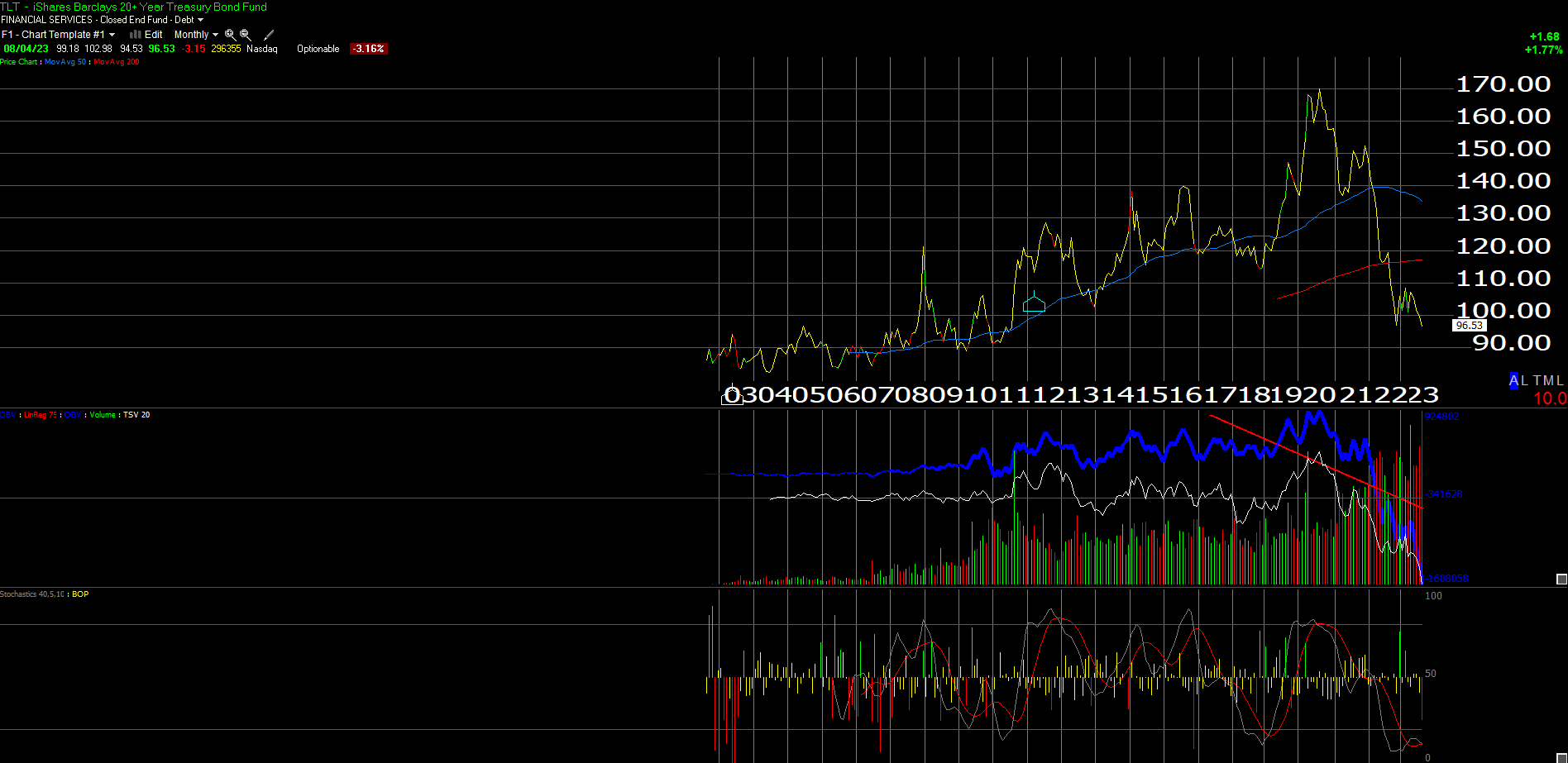
The monthly TLT is as oversold as it’s ever been in it’s 20-year history: that doesn’t mean it can’t go lower.
Take everything you’ve read today with considerable skepticism and a material dose of salt. It’s strictly one person’s opinion. Past performance is no indicator of future results. None of this is advice. All SP 500 earnings-related data is usually sourced from IBES data by Refinitiv unless otherwise noted. None of these opinions may be updated, and if they are updated, my not be done in a timely fashion. Readers should gauge their own appetite for market volatility and adjust accordingly. Capital markets can and do change quickly.
Thanks for reading.