In the summer meetings with clients, where performance is reviewed and an advisor gets some good one-on-one time with clients, this summer and really the January ’25 meetings too, much of the discussion revolved around the current 15-year secular bull market in the SP 500 and the Nasdaq, and how much longer this market could continue, and what the subsequent market would look like after the peak.
A Little History of Bull and Bear Markets:
In 1945, after Japan finally surrendered, many economists (at the time) thought the USA would see another Great Depression thanks to all the returning troops and no jobs (since WW II was then preceded by the Great Depression and 25% unemployment), but that was hardly the case. The Dow 30 – which was the index du jour at that time – rallied for a solid 23 years between 1942 – 1965, where it began to trade roughly flat for the next 15 years. (The DJIA’s low was struck December, 1941, thanks to Pearl Harbor, but ultimately the breakout is thought to have happened in May, 1942, and that was considered the start of the post WW II bull market.)
From 1965 to 1980, America experienced the 1970’s or the continuation of the Vietnam War, President Nixon and Watergate, the Arab Oil Embargo a jump in gasoline prices from $0.30 a gallon to $3 per gallon, and the ascension of Gerald R. Ford to the Presidency after President Nixon’s impeachment. In addition, Russia invaded Afghanistan, the Iranian Hostage Crisis happened (that happening late in the decade of the 1970’s), and in general it was a very tough 10 years for the country. In terms of market performance, the SP 500 saw it’s first 50% bear market in 1973 – 1974, (probably much to do with Watergate, and a “constitutional crisis”, although Nixon and Watergate seemed mild compared to today). In fact, that 50% correction in the SP 500 in ’73 – ’74 was the only 50% correction for the SP 500 in the 55 years from 1945 to 1999.
Then it all changed: from 1982 to 2000 we witnessed the greatest bull stock market in US history. The incredible growth in technology started with the explosion in personal computers and corporate productivity, in the early to mid 80’s, and then ended with the internet, which exploded with the Netscape IPO in 1995, and was possibly the greatest invention since the printing press.
So we had a 23 year bull market in the DJIA, and then 10 to 15 years of a sideways market just before and after the decade that was the 1970’s and then an 18-year bull from 1982 to 2000, market that saw the greatest creation of economic and financial wealth in US history.
From 2000 to 2009, a decade where the SP 500’s annual return was about 1.5% per year, American’s saw two 50% bear markets for the SP 500, the first eliminating the overvaluation and excesses in large-cap growth stocks and the technology sector, the 2nd bear market starting in late 2007, eliminating the excess credit and price appreciation around the single-family housing sector. The cumulative return for the SP 500 for the entire decade was just 11% – 12%.
The generational low for the SP 500 was March 9th, 2009, and we are now living in the subsequent bull market since. Where you start the new bull market could matter, since March 9th, 2009, leaves this current secular bull market at 15 – 16 years old, or if you mark the start of the new bull market where the SP 500 first made it’s new all-time-high above the mid-March, 2000’s, in early May, 2013, this bull market is 12 – 13 years old.
What are the similarities and differences between the 1982 – 2000 secular bull, and the 2009 to current secular bull market ?
Similarities:
- Top-heavy stock concentration: The SP 500 near it’s peak in March, 2000, saw a 33% weight in the technology sector. As of Friday, August 1 ’25, per the LSEG data, the tech sector’s weight in the SP 500 was 34% as of Friday’s market close.
- Technology and the financial sectors led the 1982 – 2000 bull market, and in fact were frequently called the “market generals” back then. Today, the technology (34%) and financial (13.8%) sector’s comprise 48% of the SP 500’s market cap weight. While the communication services sector wasn’t around in 2000 (it was still just telecom back then, versus META, Alphabet and Netflix today), and the consumer discretionary sector is very different today with Amazon and Tesla, I found it remarkable how the overall SP 500 market cap weights haven’t changed much.
- Back in the 1990’s it was all about the secular build-out of corporate technology, which meant first the PC in the 1980’s and then the PC evolved into a group of PC’s called the server network (and IBM fell 50% between the late 80’s and mid ’90’s after Big Iron was replaced by the server network), and then the internet explosion, while today, the “secular buildout of corporate technology is all about AI and who’s going to be first with the biggest. Apple snuck in there in early 2000, and really drove the consumer technology boom with the iPhone and iPad. The tech sector was a performance wasteland if it wasn’t for Apple, from 2000 through 2013 – 2015.
- In 1999, Julian Robertson, the legendary New York hedge-fund manager that ran Tiger Management, quit the business given what was happening around large-cap tech stocks and growth stocks. Those who short stocks in markets like late the 1990’s – where the SP 500 averaged 25% per year annual returns from 1995 to 1999 – can get carried out on their shields. In the last year – 18 months, another legendary hedge fund manager, Jim Chanos, of Kynikos Associates (actually Jim isn’t a hedge fund manager, but rather an investment advisor focusing on short-selling, per the Google description), noted publicly in November ’23 that he was closing his hedge funds that specialized in short selling. (So I guess Jim is a hedge fund manager.) These guys were two of the best and both publicly abandoned their style in bull markets that didn’t (and don’t) seem to want to quit.
- Annual returns across various equity asset classes:
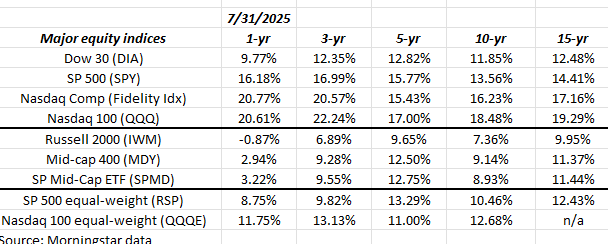
It’s probably no surprise to anyone, but large-cap growth and “momentum” (mainly tech) continue to dominate return data in terms of absolute return, while small and mid-caps and equal-weight, just like the late 1990’s, lag badly. The black-bordered area shows the annual returns for small and mid-caps versus the their larger-cap brethren. This behavior is exactly what was seen in the late 1990’s.
Differences:
- The biggest difference for me today is sentiment around this bull market. It’s nothing like the 1990’s. In this market today, we go from “extreme greed” to “extreme fear” (or just “fear”) relatively quickly, which was very different than the 1990’s. Bearish sentiment comes on rather quickly in today’s market, far faster than what I recall from the late 1990’s.
- Another difference is “earnings weight” relative to market cap: in March, 2000, the tech sector was 33% of the SP 500’s market cap, BUT the earnings weight was thought to be 13% at that time. Today, with the tech sector’s market cap at 33%, the tech sector’s earnings weight is closer to the low 20% range from the last stat seen.
- Frankly, the quality of earnings (in my opinion) is far better today than in the late 1990’s. This blog measures quality of earnings by comparing operating cash flow (numerator) vs trailing net income (denominator), either as trailing-twelve-month (TTM) or annually. 1x coverage is pretty standard today. anything below 0.75x – 0.8x usually gets my attention. Ironically, the two companies I’d give lower grades today in terms of “quality of earnings” are Coca-Cola (KO) and Oracle (ORCL) although both have addressed this issue publicly.
Summary / conclusion:
Last November 10th, ’24 this article was written on this blog, just to continually remind myself (and clients) that chasing “return” here is getting dangerous. That being said, this bull could last until 2029 – 2030. One aspect to the recap above is that changes in decades, as the calendar turns tends to generate changes in bull / bears, etc., so sure this market could go on a few more years at least.
One portfolio construction aspect to this is to explain to clients about “non-correlated” and what that means to account performance relative to the stock market.
The toughest trade today is the Russell 2000 (IWM) and that’s what’s being added to client portfolios in small doses. Another long-out-of-favor asset class is emerging markets, which was written about recently. Here’s a list of stock or asset classes that have lagged the benchmarks badly and represent “non-correlated” trades to growth or balanced portfolios:
- Nike (NKE)
- Cisco (CSCO)
- Intel (INTC) – haven’t bought it yet but it’s basing at $20. Capex is an absolute killer.
- IBM (IBM) – wrote about it for 10 years – stock finally moving after “Waiting for Godot”.
- Boeing (BA) –
- Mid-Cap SP 400
- Russell 2000
None of this is advice or a recommendation, but only an opinion. Past performance is no guarantee of future results. Readers should gauge their own comfort with portfolio volatility, and adjust accordingly. None of the above information may be updated, and if updated, may not be done in a timely fashion.
Thanks for reading.