Big picture market analysis:
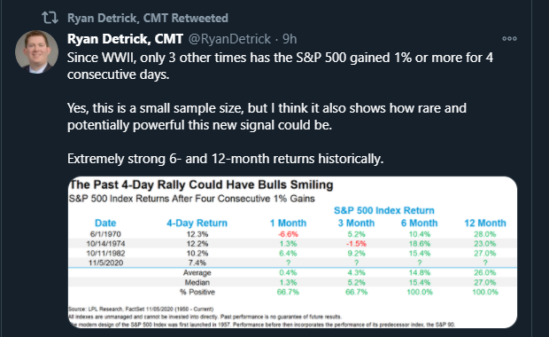
Ryan Detrick market strategist at LPL Financial, and excellent technician, posted this table last week on consecutive 1% returns for the SP 500 and what they portend for “forward SP 500 returns”.
Not bad.
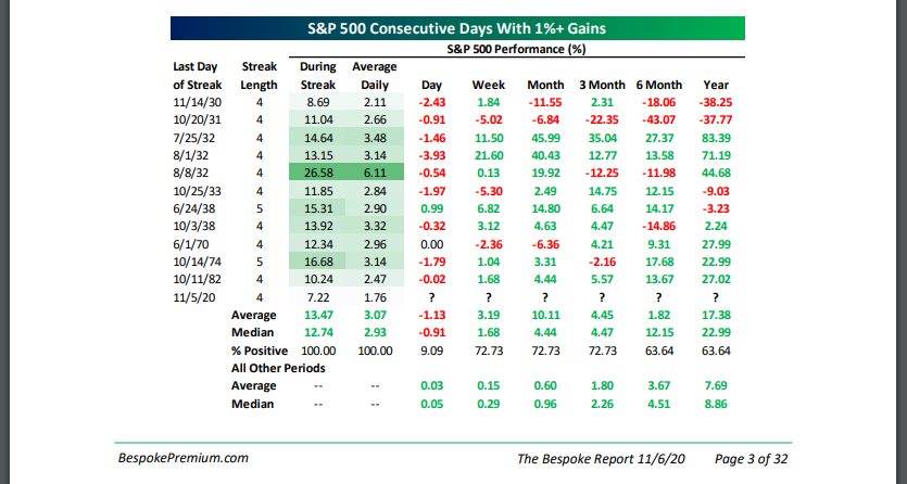
Bespoke followed up Detrick’s table with one of their own in the weekly Bespoke Report published November 6th, 2020. The math is similar – the market action Monday – Thursday of election week portends positively for the next 12 months.
——————————-
The SP 500 rose 7% this week, the Nasdaq Composite rose 9%, and for portfolio managers watching not just the overall market, the sector changes and the “game within the game” so to speak, showed a return of the “large-cap growth” trade that was the late March ’20 to September 2, ’20 trade.
The SP 500 is still below it’s all-time high of 3,588 and the Nasdaq is still below it’s all-time-high of 12,074, both printed in early September ’20.
Since that time we’ve seen churning and back-and-forth action.
However, here are the various asset classes being watched for longer-term breakouts:
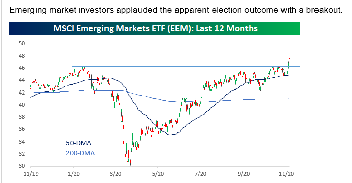
This graph from Bespoke’s publication on Saturday, November 7th, shows the breakout in EEM and the emerging markets that was written about on this blog on Thursday night, November 5th, 2020.
The “EM’s” as emerging market are called, have been dormant for years, since their 2007 peak. They are starting to stir.
Note on the linked Thursday night update from this blog the “average, annual” return of the SP 500 (+13%) versus the EM’s (+2%) for the last 10-years.
Gold chart:
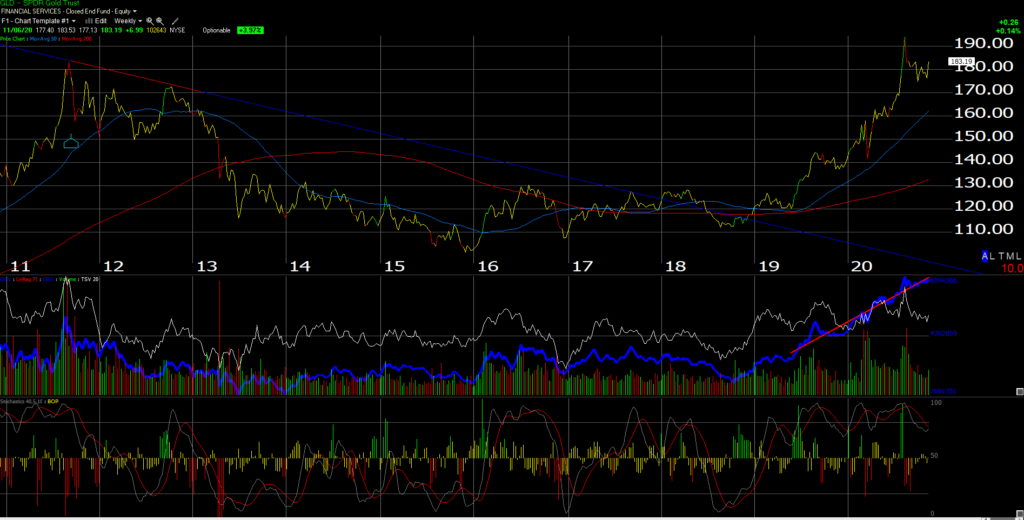
The September, 2011 high for GLD (the gold ETF) was $185.85 and that level has still not been taken out convincingly on the chart. GLD traded above $185.85 in August ’20 but dropped right back down on the false breakout.
The weaker dollar likely helped it this week.
Client’s brief history of owing gold for their portfolio’s was that gold was bought in early 2000 after the price of physical gold bullion declined from $800 in 1980 to $250 or so in late 1999, but since bullion couldn’t be bought directly (custodied in Schwab accounts), portfolio managers like myself had to own equity of gold companies like Newmont Mining (NEM). The GLD ETF, didn’t come public until early, 2005 (which then represented all client gold exposure) and that was owned for clients until ultimately the GLD was sold around $155 later in 2011.
Gold prices fell from $800 to $200 from 1980 to the year 2000 as the SP 500 soared in the 1980’s and 1990’s, and then traded up from $200 – $250 in early 2000, to $1850 in September, 2011, at a time when the SP 500 experienced it’s worst decade of returns since the 1930’s when the SP 500 had a cumulative return from 2000 to 2009 of just 12.5%.
Hence, my 40 year experience with the yellow metal shows that over long periods of time gold’s price action tends to correlate negatively to longer-term SP 500 returns. Clients could have owned the GLD ETF when it fell to $100 in late 2015, but instead I passed for gong long again, missing a great rally.
Personally I’d rather wait for the breakout above $185.85 or $186 or even higher, but even better action would see the GLD rally smartly and a flat-to-lower SP 500.
Like with Emerging Markets, the GLD’s 10-year “average, annual” return per Morningstar data is just 2.99%, far below the SP 500’s +13.3% 10-year return.
The March, 2000, Technology and large-cap growth peak coincided almost precisely with the decades-low print for gold bullion prices.
One catalyst for the sale of the GLD from client accounts in 2011 was the Wall Street Journal article noting that a New York billionaire had his entire investable wealth in gold.
One final comment on gold: I have found over the years the precious metal seems to be a Rohrshack test for the investment community in terms of what influences gold pricing. Weak dollar, strong dollar, trade policy (growing deficits, etc.), monetary policy, inflation, deflation, foreign central banks, the US Fed, the ECB, and it goes on and on and on.
I hope readers don’t mind the personal perspective. I was a sophomore in college studying Money & Banking when Paul Volcker was driving the fed funds rate to 20% in 1980 and I walked into the book store and found “The Coming Great Depression” by Douglas R. Casey. The greatest two decades of SP 500 cumulative returns was just starting.
The GLD could be starting to stir.
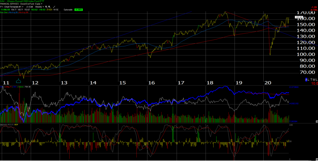
Biotech (XBI): / Russell 2000 (IWM)
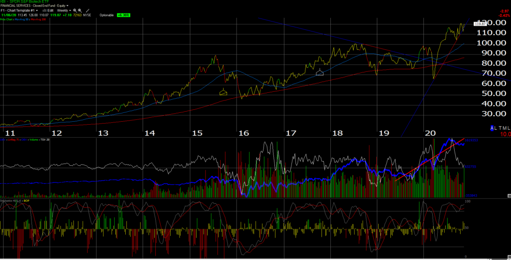
The Biotech ETF (XBI) has been a frustrating trade all year and with the announcement on Biogen (BIIB) late Friday after the close, it could get interesting Monday morning, November 9th, but the XBI owns no BIIB in it’s top 10 positions.
The XBI makes me a little bit nervous given all the investing dollars that has poured into the health care sector this year both from an investing and R&D perspective. Could the identification and distribution of a Covid-19 be a top for biotech and the health care sector?
A number of better technicians than I still like the XBI chart. Just play it accordingly.
The Russell 2000 (IWM) might be given a higher preference given it’s clear peak in August, 2018 near $173, in terms of risk / reward and the ability to hold in a pullback.
Some think an improvement in high-yield credit spreads drives Russell 2000 alpha, but we’ve certainly seen an improvement in corporate high-yield credit spreads since the March ’20 lows, but the IWM still cannot break above that 2018 high.
Using the 10-year Morningstar returns, the XBI has a +20% 10-year return while the Russell 2000 has a +9.97% 10-year Morningstar return, both closer to the SP 500’s 10-year return than the Emerging Markets and Gold ETF (GLD).
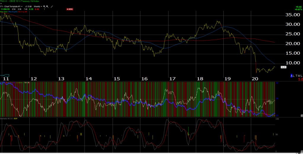
This is a weekly chart of the CBOE-traded 10-year Treasury yield index. The top was cut off so readers could be shown the bottom third panel completely.
The 10-year Treasury yield has been “oversold” now for 2 years, since Jay Powell started reducing the fed funds rate in early, 2019.
By the way, Jay Powell’s term expires in February, 2022, however that doesn’t mean that he couldn’t be replaced by President Biden before then.
A move in the 10-year Treasury yield above 1%, would likely cause reverberations in the bond markets.
Last Chart: US Dollar Bull (UUP):
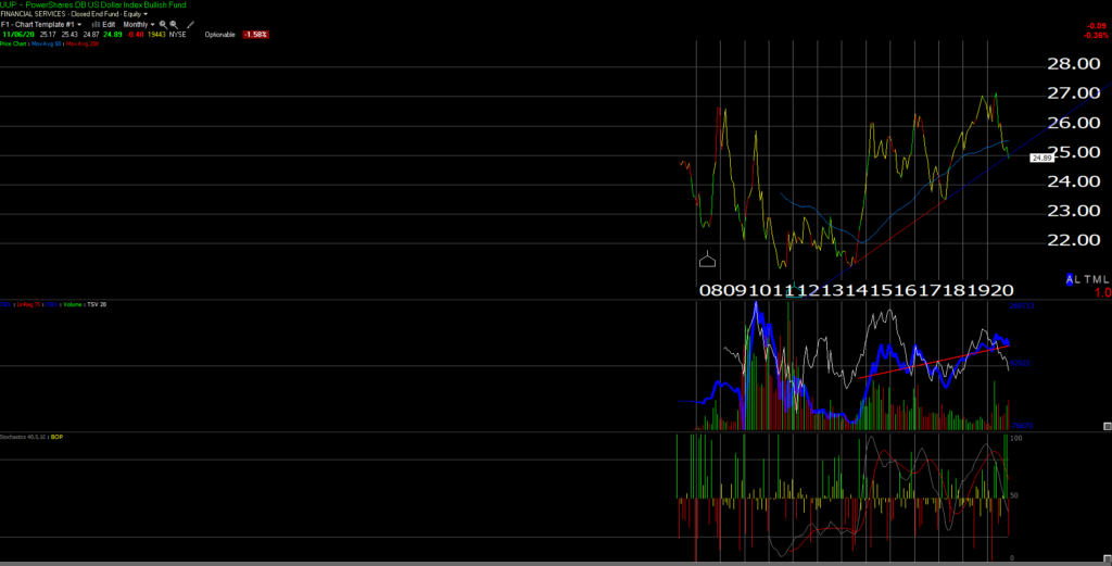
The US dollar weakened again this week. This monthly chart of the UUP (dollar bull ETF) is meant to show the weakness in the dollar vis-a-vis the euro and the yen.
What struck me was the dramatic spike in the dollar in late 2014, early 2015, which coincided with the drop in crude oil from $90 – $100 in mid 2014, to $28 in Q1 ’16. The uptrend line since looks like it is starting to be broken.
While everyone has been calling for the US and the dollar to lose “reserve currency” status since the late 1980’s, a gradually weaker dollar has positive effects for the US stock market.
40% of the SP 500 revenue is “non-US” and more than 50% of the Tech sector’s revenue is “non-US” although that could have changed with Covid-19.
I don’t think it’s so much about whether the dollar is weak or strong, but about the “rate of change” and the duration of the trend.
Summary / conclusion:
Today was a longer post than expected, but at any given time there are “secular” and cyclical cycles impacting many different asset classes.
Emerging Markets and GLD have compelling 10-year returns vis-a-vis the SP 500’s return to warrant paying attention to looming breakouts, if they should happen. Readers should remember, like the GLD earlier this year, we can see a trade above a long-term resistance levels and then a return below.
While the +13.3% 10-year return on the SP 500 scares me to death, the 2% 10-year emerging market return and the +2.99% 10-year return for the GLD tells me we could see a year, maybe a little longer where the EM”s and GLD have stellar returns as the SP 500 lags considerably.
That being said, the “average, annual” return for the SP 500 starting on January 1, 2000 is about 6% and going all the way back to 1990 is around 5%, still well short of the 1923 – 2020 (yes, 97 years) “average” return per the Ibbotson data of around 12% for “large-cap stocks” i.e. the SP 500.
Take everything written here with a considerable grain of salt, and assume any or all of this could be right or wrong at any given time.
The Presidential election will have capital market consequences, possibly even more so after the US Senate races from Georgia hold their runoff on January 5th, 2021.
Thanks for reading.