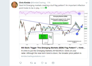
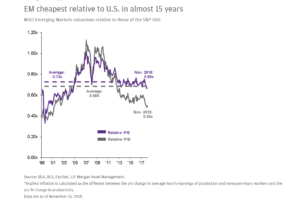
Not one but two charts this week caught the eye, the first being the bottom chart which shows “relative P.E’s” of the US vs Emerging Markets, from JP Morgan. Not being a big fan of the “relative” valuation metrics, since during the late 1990’s Tech and large cap growth explosion analysts would issue buy recommendations saying “the stock is trading at 35x revenue and 300x earnings versus the sector’s 50x revenue and 600x earnings valuation, so we think its cheap to the sector” which did investors absolutely no good in 2001 and 2002.
However at 15x earnings, and given their muted returns over the last 10 years, Emerging Markets are – I think – still attractive over a 3- 5 year period. The YTD return of the EEM is -12% (price) and the 3 and 5 year returns are 6.79% and 1.40% respectively per the Morningstar data.
The first chart is from Chris Kimble of Chris Kimble Solutions and shows the coiled nature of what Chris calls a “bullish flag pattern”.
Summary / Conclusion: What surprised me in preparing for this post tonight was that the EEM is up 5% – 8% in the last month per the Morningstar data. Client’s biggest weights are in the EEM, VWO and also the OakMark International fund managed by David Herro, which invests in developed markets as well.
The EEM and VWO have each gravitated around the $40 price level since last summer and appear to be basing as Chris Kimble’s chart suggests.
What comes out of the G20 will be very important, but a weaker dollar will help the asset class. A stable to weaker dollar is preferred. Like earlier this year with the dollar strengthening, Emerging Markets tend to lag when the dollar is in an uptrend.
This blog has been early and wrong on our Emerging Markets entry other than the Q1 ’16 buy, but the asset class weight coming out Q1 ’16 was just 3% – 6%. Here are the earlier articles on EM’s: here, here, here and here.
Being wrong on a position tends to incent more writing about it. It eases the stress of being wrong.
Thanks for reading.


