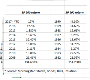
Still trying to use the Snipping Tool on Office 10, so excuse the 2nd grade, “paint by numbers” quality of the Excel table/chart.
The above table shows the first 8 years of this bull market in the SP 500 versus the first 8 years of the 1980’s bull market that started in August, 1982 with the end of Paul Volcker’s “monetarist experiment”.
Readers can quickly see the SP 500’s total return was greater by a cumulative 16% – 17% in the 1982 bull, but the range of the first 8 years of returns was far greater in the 1980’s: there were 4 years greater than 20% in the 1980’s versus just two years in the 2009 bull market, (2017 isn’t done yet, there is a small chance the SP 500 could see a 20% return this year), while the SP 500 saw three years under 6% – 7% in the 1980’s versus just two years since 2009.
This has been a much “smoother” bull market in my opinion, just eyeballing the data.
The up years have been less dramatic and so have the lower-return years.
What’s it all mean ? Not sure, just thought i’d gaze at the navel this weekend.
The two big differences I see since ive lived them both up close and personal:
1.) Interest rates were near 30 years high’s in the early 80’s and gradually came down during the 1982 bull, while the 10-year Treasury yield is near 30 year lows currently and likely to rise;
2.) The banking system went from near-utility status in the early 1980’s to tremendous capital, jobs and loan creation, while the opposite happened to the banking system with the 2009 bull, as regulation gradually constricted the banks, requiring more capital be held against less portfolio risk.
There are a lot more differences, but the blog post will be kept short and sweet.
Thanks for reading…