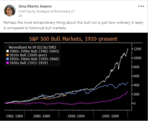
This is a great graph from Gina Martin Adams, Chief Equity Strategist at Bloomberg.
You have to squint to see the orangeish line showing the chart of the “2010’s” bull market and how its slope and length compare to other bull markets – the late 1990’s looks pretty crazy now, doesn’t it ?
Some charts you just don’t need to explain.
Thanks for reading…