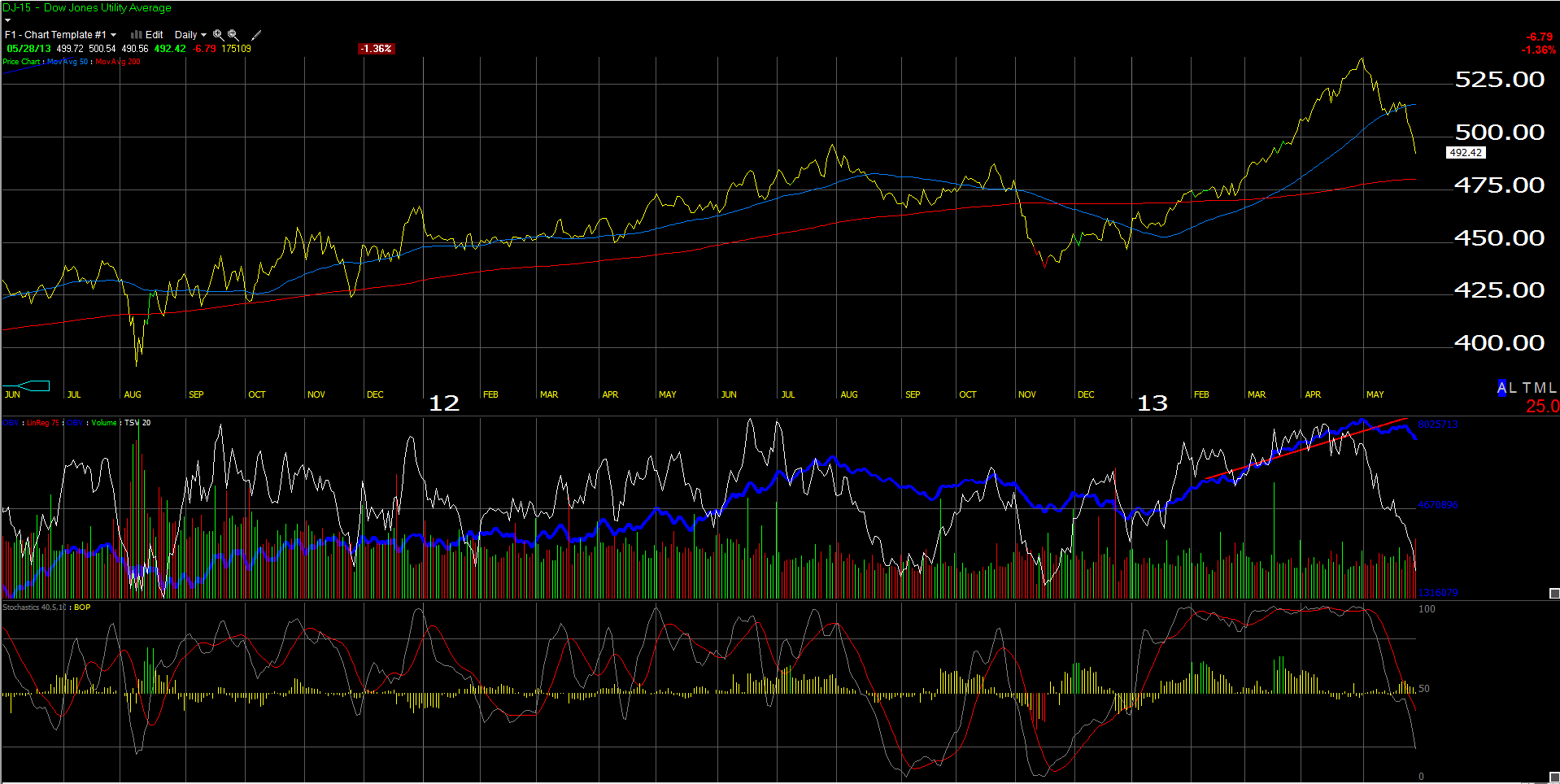
Back in the 1990’s I would always hear portfolio managers talk about the correlation between interest rates and the utility averages, and this time is no exception, as the Dow Jones Utility Average has gotten crushed since April 30th, as we start to see higher interest rates.
Today, the 10-year Treasury yield closed above the March 8th, 2013 year-to-date high of 2.09%, closing near 2.17%, indicating that the 10-year Treasury is on the cusp of a bigger breakdown.
The next key yield level is 2.39% or the March, 2012 high for the 10-year Treasury.
However, back to Utilities: the high coupons, good dividend yields and the stable earnings growth, has resulted in the thinking that Utilities are “bond proxies” (meaning their trading action and profile is derived from the bond market action) and the above chart validates that sentiment.
Ute’s (as i call them) comprise 3% of the SP 500, and don’t generate much earnings growth as a sector. In fact, in Q1 ’13, Ute’s as a sector generated 6.5% revenue (pretty decent, as the SP 500 revenue growth for q1 ’13 was flat), while earnings growth for Utilities were +1.5% for Q1 ’13.
Ute’s are thought of a as a defensive trade, and this market is anything but, hence the 7.5% drop in the Utility Average since May 1, 2013.
I never really owned them for clients at any point in the last 10 – 15 years. With the prospects of the 30-year bull market in Treasuries ending, we are far less inclined to do so now.
We will be out with a longer look at the sector tomorrow, Wednesday, May 29th.
(Long: None, may pay to short)
Trinity Asset Management, Inc. by:
Brian Gilmartin, CFA
Portfolio manager