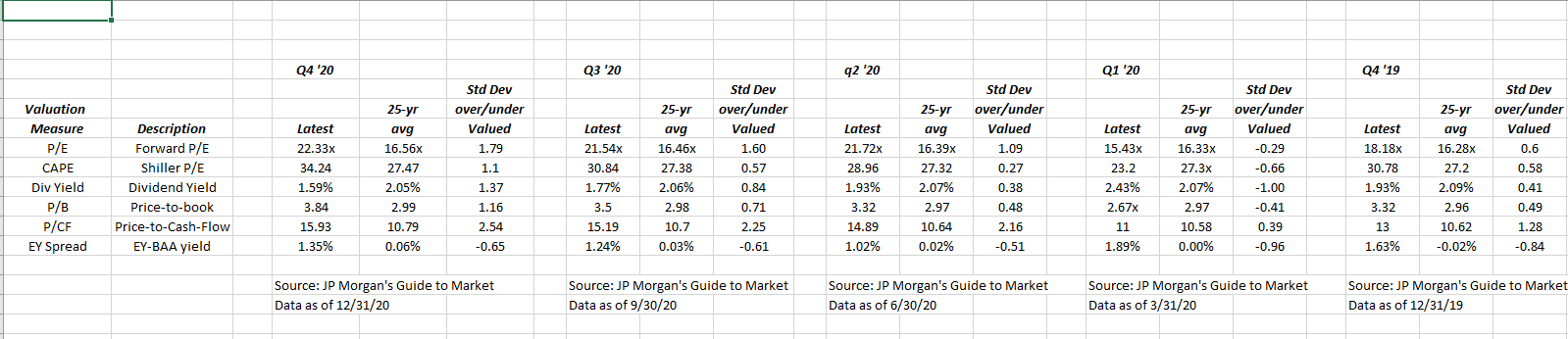
One of the favorite research pieces received every quarter is JP Morgan’s Guide to the Markets, and usually in the first few pages, Dr. David Kelly’s team walks readers through the various valuation metrics of the SP 500, which are found in the above table.
This blog tracks and records the quarterly valuation metrics to try and gain a longer-term perspective on the data.
The above table shows the last 4 quarters of metrics.

This second table shows the valuation metrics as of 12/31/20 and then 12/31/15.
Those are big differences between Q4 ’20 and Q4 ’15 valuation metrics.
The one aspect to the mainstream financial media is that there are always vocal bears and have been since 2010. The “valuation” argument is a constant argument for the bear crowd at most any time of a secular bear market.
One of the reasons I like this table is the “price-to-cash-flow” valuation. It is tough to find cash-flow valuation data on the SP 500.
Only Blackrock’s Rick Rieder quotes a “free-cash-flow” yield for the SP 500 and he estimates that at around 5%.
Summary / conclusion: There is no question recent valuation metrics are getting extended and the first spreadsheet shows that, just over the last year. The price-to-cash-flow metric for the SP 500 went from under 10x in the earlier part of the 2010 – 2019 decade to near 16x in Q4 ’20.
This is what happens in secular bull markets.
Now readers have to consider too that SP 500 EPS is distorted, and too low after the Q2 and Q3 ’20.
It’s tough to make stone-cold call on the market using valuation data that is distorted by Covid-19 and the pandemic.
That being said the numbers are stretched.
Thanks for reading.