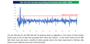
This Bespoke graph from the July 2, 2020 weekly Bespoke Report, shows the SP 500 having it’s best 100-day return since 1933.
The bull / bear debate requires a separate post, but this set-up is actually a little bearish per the Bespoke data analysis, at least for the next week or so.
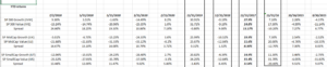
The main reason for today’s post is to update readers on the “style-box” analysis, where a look is taken at the performance of the various style-boxes from large-cap growth to small-cap value.
Apologies to readers, but the style-box analysis wasn’t run on June 30th, bur rather after the close on July 2nd, or the start of the long-weekend.
Return source: Morningstar
To no one’s surprise, large-cap growth continues to dominate the return box, as mid-cap and small-cap value continue to lag the growth factor.
What’s somewhat surprising is that large-cap growth has a 25% performance alpha over large-cap value since 3/31/20, which has steadily increased since the pandemic began. Certainly technology and the cloud were two giant beneficiaries of the pandemic. Usually when the US economy is hit with a recession and the US stock market is hit with a bear market, market leadership has usually been different after the event.
Not to much this time. The prevailing leadership of large-cap growth and Tech not only has continued but accelerated.
For the mid-cap and small-cap spaces too, “growth” has outperformed the “value” segment in each of those market cap sectors.
In mid-caps, Growth has returned roughly 19% since 3/31/20, while Value has returned roughly 14%, in Q2 ’20, and in small-caps, “growth” is up 16% while small-cap “value” has returned 12%.
Summary / conclusion: One aspect that surprised me looking at the data (again), was that for full-year 2019, “growth” and “value” were equal for large-cap and with smaller differences in mid and small-cap. I had forgotten about that. The pandemic has initiated the battle between the “haves” and the “have-nots” and the performance disparities are far greater today than in late 2019.
About a month ago, a CFA Chicago webinar with a major domo from Guggenheim, noted that typically small-caps do better when high yield credit spreads start to improve. Although it’s not shown on the spreadsheet, high yield spreads have improved considerably since late March, but the performance gap has failed to close large-cap and small-cap.
Another interesting aspect to the fixed-income asset classes, is that EMB (or the Emerging Markets Bond ETF) has recovered all of its YTD loss, and is now roughly flat on the year. The EMLC or the emerging market local currency bond ETF is still down more than 6% on the year, as of July 2nd.
2nd quarter earnings which start in 2 weeks might start to shift some of the relative performance metrics.
Remember, this is all historical data. It can change quickly and this style-box analysis won’t likely be updated until mid-August ’20.
Thanks for reading.