There is a few similarities between today’s SP 500 and the SP 500 back in the late 1990’s.
Ed Yardeni has made the point the last few years that the “earnings weight” of the top technology names in the SP 500 today is much higher than it was back in the late 1990’s, when the tech, and large-cap growth and dot-com frenzy began to fall apart in the early 2000’s.
The earnings weight today of the Top 10 SP 500 stocks remains below the market cap weight, but the difference is less today than in the late 1990’s.
IBES by Refinitiv – from what they told me previously – either didn’t have this data available or they simply weren’t providing it to subscribers, have now provided this blog with the data, as of the latest request this last week.
Here is the market cap weight vs the earnings weight of the Top 10 SP 500 individual stocks:
- Apple: 6.05% mkt cap wt, 4.59% earnings weight
- Microsoft: 5.94% mkt cap wt, 3.67% earnings weight
- Amazon: 3.94% mkt cap wt, 1.48% earnings weight
- Alphabet: 4.38% mkt cap wt, 1.84% earnings weight (Alphabet’s total mkt cap wt is the sum of both GOOGL + GOOG mkt cap wts).
- Facebook: 2.22% mkt cap wt, 1.98% earnings weight
- Tesla: 1.6% mkt cap wt, 0.26% earnings weight
- Nvidia: 1.45% mkt cap wt, 0.58% earnings weight
- Berkshire (class B): 1.36% mkt cap wt, vs 1.22% earnings weight
- JP Morgan: 1.29% mkt cap wt, vs 2.54% earnings weight
- Johnson & Johnson: 1.14% mkt cap wt, vs . 1.47% earnings weight
- The market cap rankings are taken from Morningstar’s site, the SPY portfolio, as of 9/24/21
- Both GOOG and GOOGL (Alphabet tickers) are in the top 10 of the SP 500 by market cap weight
- To qualify this comparison, the market cap weights are as of 9/24/21, while the “earnings weight” for each company is as of June 30 ’21. Thus readers are looking at current mkt cap weights, but what are now 90 day old “earnings weights” based on the last quarter results reported.
- The Top 10 market cap weight sums to 30%, while the Top 10 earnings weight sums to 19.6%. (This is actually a little wider of a difference than suspected.)
Here’s some thoughts and commentary on the rankings:
Apple and Microsoft are thought to be close to 50% of the tech sector’s market cap (maybe a little lower today, closer to 45%). However the two biggest stocks in the SP 500 now compose 11.99% of the total market cap of the SP 500, and 8.26% of it’s earnings weight. (Think about that…)
The two biggest weights in the Consumer Discretionary sector are Amazon and Tesla. Both stocks combine to have a 5.54% market cap weight, but just a 1.74% earnings weight. There is no question that Tesla (of the Top 10 market cap weights in the SP 500 today), most closely resembles a late 1990’s Nasdaq stock in terms of its relative valuation between market cap and earnings weight, than any of the other Top 10 positions, with just a 0.026% earnings weight.
Those stocks where there is a close proximity to both market cap and earnings weight – outside of Apple and Microsoft – are Facebook and Berkshire (class B).
Finally, the most interesting aspect to this breakdown is both JP Morgan (JPM) and Johnson and Johnson (JNJ), have earnings weights greater than their market cap weights.
Given all this, would it be safe to assume both JPM and JNJ have potentially more upside than those stocks with a market cap weight greater than an earnings weight ?
But that’s hard to say. The fact is “secular bull markets” are evidenced by “PE expansion”. The best and most classic example of this was Walgreens (WBA) in the 1990’s. It started the decade trading at roughly 10x forward estimates and was growing EPS about 10% per year, and by the late 1990’s – because of Walgreens “large-cap growth” label (and also because of its decade of earnings growth) the stock ended the ’90’s and went into the year 2000 with a 40x PE ratio, and close to a 20% annual EPS growth rate.
And then, like a lot of growth stocks that peaked in the 2000’s, WBA proceeded to NOT make a new all-time-high until 2013.
Valuation today versus the late 1990’s:
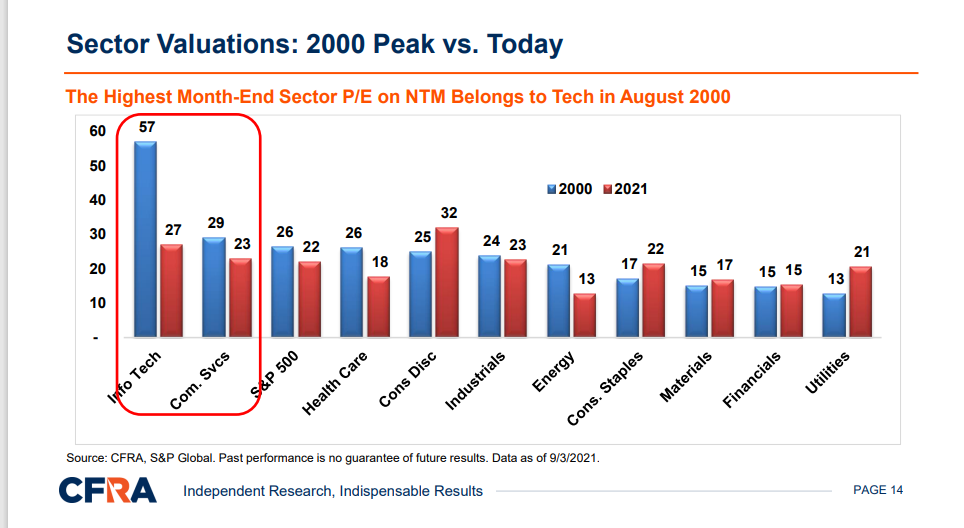
Source: CFRA(Lowry)
CFRA along w Lowry Research did a webinar on 9/15/21 talking about these market cap issues and the similarities to the SP 500 today.
From the above bar chart, most SP 500 sectors today – including tech – are trading at a lower PE than the late 1990’s.
Summary / conclusion: The fact is the 30% market cap weight and the 19.6% earnings weight of the Top 10 SP 500 names was a little surprising when IBES by Refinitiv provided me with the data this week. Again, the “earnings weights” are as of the June 30 ’21 quarter end, and thus are 90 days old.
For readers, this is another “risk measure” that is worth discussing given the similarities to the SP 500 today vs the SP 500 in 1999.
Readers can tell me if they find any value in the information or not.
Remember, take everything you read with great skepticism, and detachment. Context is important. Markets change quickly.
And a big thanks to the Refinitiv staff, for providing the earnings weights of the Top 10 stocks in the SP 500. Formerly, this data was only being provided as earnings weights within the sector, not the SP 500.
Finally, what’s the interesting question for me is how do all 500 S&P companies rank in terms of market cap vs earnings weight, and do the companies like JP Morgan, and Johnson & Johnson represent value propositions given their earnings weights being greater than their market caps ?
Thanks for reading.